Schedulot

Problem
Existing free online scheduling apps are not optimized for mobile users.
Solution
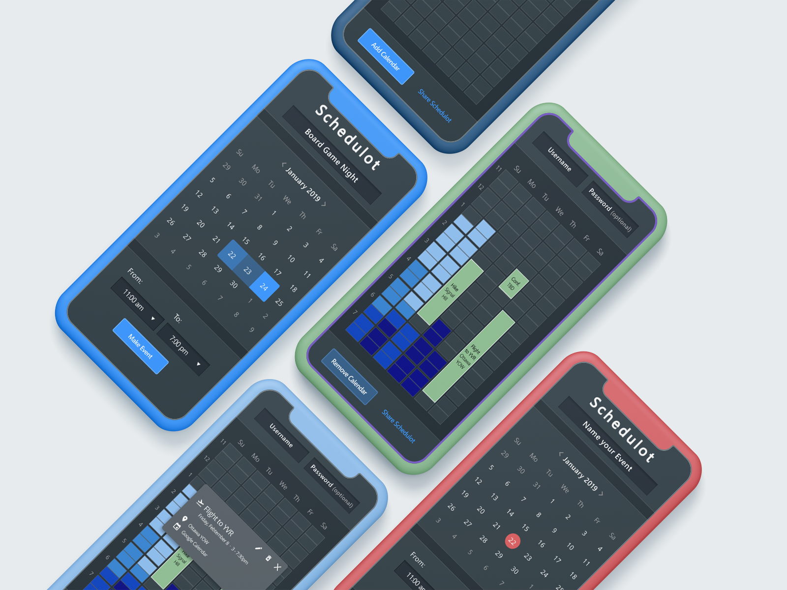
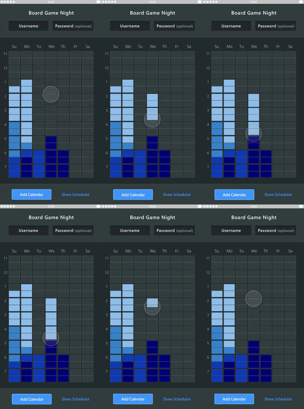
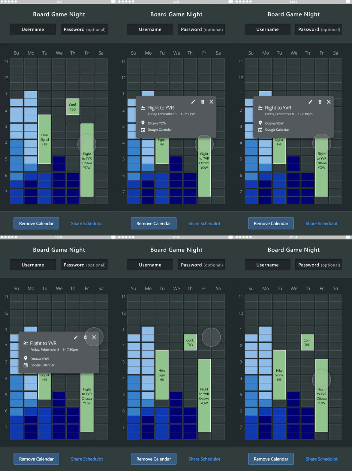
We identified several common pain points of current scheduling apps, such as frequent misclicking, lack of calendar integration, and hidden information due to mobile restrictions. We designed key features to include a heat map, integrated calendar, and layered contextual information.
Process
As our working group had struggled with mobile scheduling, we started with internal insights into alternative tools, pain points, and possible areas of improvement.
Generative Research
Two audiences blah personas something research internal eyemoles and friends Organizers and Attendees.
Organizers experienced trouble with: hidden attendance, lack of automatic reminders, and lack of filters for attendee availability times.
Attendees experienced trouble with: Frequent misclicking, forgotten calendar dates, and a lack of a “maybe” reply.
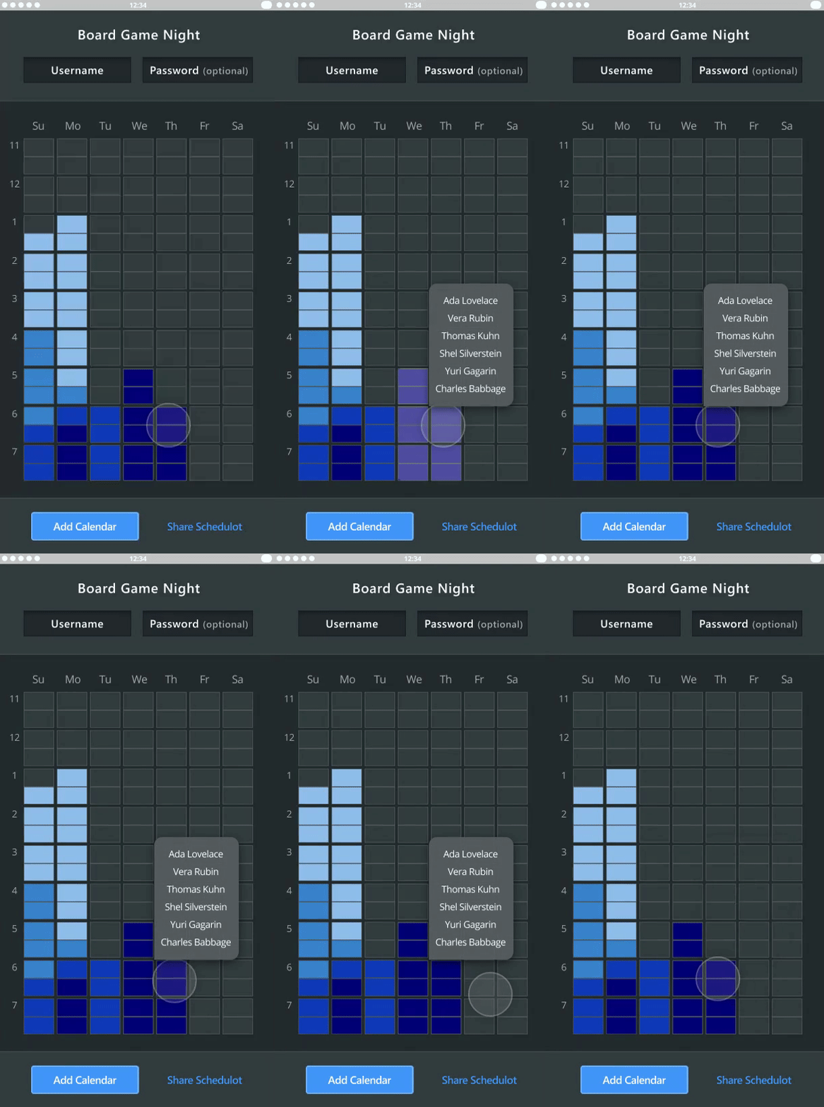
We prioritized mistapping, forgotten availability and hidden attendance for our prototypes.
Prototypes
We designed three iterations informed by usability testing. We chose a single hue scheme for the heat map instead of diverging colours. We gave the calendar an interactive pop-up card that gives the user more information and autonomy. Finally, we chose a ripple effect to convey which timeslots mapped to the attendee list.


